
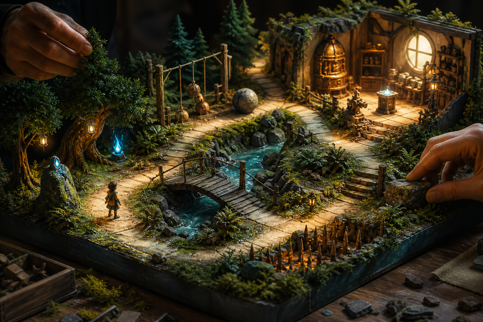
The first ten minutes of a game carry an unusual burden. They must establish a world, create curiosity, introduce controls, reveal a goal, demonstrate consequences, and convince the player that learning will be worth the effort. Every new idea competes with unfamiliar visuals, sounds, interface elements, and expectations. If the opening explains too little, the player feels lost. If it explains everything, play becomes an instruction queue.
Effective game tutorial design does not begin by writing better pop-ups. It begins by arranging experiences so that an action feels reasonable before it is required, its result is immediately visible, and the player gets another chance to use it with slightly less support. Text can clarify names or unusual rules, but the primary teacher is the game itself.
Designing a tutorial players can learn without reading is therefore not a ban on words. It is a test of structural clarity. If a player skips every optional sentence, can movement, space, animation, sound, and consequence still communicate what matters? When the answer is yes, written guidance becomes reinforcement instead of life support.
Define what the opening must actually teach
Tutorials often become crowded because every system is treated as immediately essential. Before building the opening, separate knowledge into three groups: required now, useful soon, and meaningful later. Required-now knowledge includes only what the player needs to make the next few decisions. A crafting tree, advanced combo, faction rule, or rare status effect can remain hidden until the player has a reason to care.
Write the opening objective as player capability rather than content exposure. “Show the inventory” describes a screen. “The player can recognize when to collect, equip, and use one item” describes learned behavior. Capability statements force the designer to include an opportunity to act and a way to observe whether the action was understood.
A practical opening might target five capabilities: move with intent, control the camera, interact with a highlighted object, recognize danger, and complete one meaningful goal. This is already a substantial cognitive load. Everything else should either support those capabilities or wait.
Map the first ten minutes as a learning arc
The opening needs rhythm. Teaching every control in the first room overwhelms working memory, while delaying feedback makes early actions feel pointless. Divide the ten minutes into short phases that alternate instruction, confirmation, choice, and payoff.
Orientation
Primary purpose: Establish control and direction. Player experience: Move, look, and identify a nearby destination.
First interaction
Primary purpose: Teach the core verb. Player experience: Perform one action and see an immediate change.
Safe variation
Primary purpose: Confirm understanding. Player experience: Use the same verb in a slightly different situation.
Small decision
Primary purpose: Introduce agency. Player experience: Choose a route, tool, target, or sequence.
Opening payoff
Primary purpose: Give learning a purpose. Player experience: Resolve a threat, reach a place, or unlock a possibility.
The phases do not need equal lengths. A movement-heavy game may spend two minutes on orientation, while a familiar genre may establish it in seconds. What matters is the progression from supported action to independent use. The player should finish the opening having done something that resembles the real game, not merely having toured its buttons.
Teach one action-consequence loop at a time
A learnable mechanic has three visible parts: an opportunity, an action, and a consequence. The environment presents a reason to act. The player performs the input. The game responds clearly enough that cause and effect can be connected. If any part is weak, players may succeed without understanding or fail without knowing why.
Suppose a game teaches a dash. A narrow hazard approaches slowly, leaving ordinary movement barely insufficient. A clear lane suggests escape. When the player dashes, animation, sound, motion, and the avoided hazard all confirm the action. A second hazard then arrives from another angle with less prompting. The lesson is not the button label; it is that dashing solves a recognizable timing problem.
Do not introduce a second mechanic before the first has produced a complete loop. Simultaneously teaching dash, stamina, directional aiming, damage, and invulnerability makes failure ambiguous. If the player is hit, neither player nor designer knows which idea failed. Isolate the first use, then layer relationships once each component is legible.
Repetition should vary the situation rather than duplicate it exactly. The first interaction may be strongly staged. The second should require recognition. The third can combine the mechanic with a modest choice. This sequence moves from imitation toward understanding without demanding a sudden leap.
Let the environment carry instructions
Level layout can communicate where to go and what to try before any prompt appears. Lighting, contrast, movement, framing, and open space attract attention. A corridor narrows the early decision set. A visible landmark gives movement a purpose. An object placed across the natural path becomes difficult to miss without feeling like an arbitrary lesson station.
Affordances must remain consistent. If climbable edges have a distinctive shape, material, or animation in the tutorial, later climbable edges should use the same language. Teaching a visual rule and then abandoning it damages trust. Players stop reading the world and wait for interface instructions instead.
Use composition to protect the learning moment. Do not place decorative motion, collectible effects, dialogue, and an important enemy entrance in the same visual field when the player is meant to notice one interaction. Attention is finite. The tutorial should control competition without making the space feel empty.
Create safe failure with fast recovery
Players learn through prediction and correction, so early failure must provide information. A missed jump should reveal whether the timing, direction, or distance was wrong. An attack should show whether it connected and why it was ineffective. A vague failure followed by a long restart teaches frustration rather than skill.
Early experiments should be inexpensive. Use forgiving damage, nearby checkpoints, quick resets, or spaces where the player can try again immediately. Safety does not require removing consequences. It means the cost of gathering information is low enough that curiosity survives.
Recovery should return the player to the decision, not to unrelated setup. If a challenge tests a dodge, restart just before the readable threat. Replaying a slow conversation, lengthy walk, or unskippable animation turns every attempt into punishment. Fast recovery keeps attention on the concept being learned.
Use prompts as temporary scaffolding
A prompt should arrive when the action is relevant, not when the player is busy with another demand. It should name one action, remain visible long enough to use, and disappear after demonstrated success. A wall of control labels at the beginning asks players to memorize inputs without meaning.
Prompts also need an exit strategy. After the first success, remove the instruction and present a second opportunity. If the player hesitates or fails repeatedly, restore a lighter hint. This responsive structure distinguishes between someone who has learned and someone who happened to press the correct button once.
Text should support perception rather than contradict it. If a prompt says to interact but the relevant object resembles background decoration, the visual design is still failing. If an icon points toward a goal while level composition pulls attention elsewhere, the player receives competing messages. Align every channel around the same intended action.
Preserve agency while controlling complexity
A tutorial can guide firmly without making the player feel inert. Offer small choices that all exercise the same lesson. Let the player choose which of two objects to inspect, which safe target to attack, or which short route to take. The decision creates ownership while keeping the learning objective stable.
Avoid fake choices whose consequences are immediately erased. Players quickly notice when the game asks for a preference but treats every answer identically. Even a small response can matter: different feedback, a changed position, a resource gained, or a later visual detail can acknowledge the choice.
Agency also includes pacing. Some players will experiment; others will move directly toward the goal. Optional practice spaces can serve the first group without delaying the second. The critical path should prove minimum competence, while nearby opportunities allow deeper rehearsal.
Introduce interface elements at the moment of need
Every meter and icon creates a question. If a resource has no immediate relevance, displaying it early consumes attention without teaching anything. Reveal interface elements when the player performs the action that affects them or faces the decision they inform.
When a health meter appears after the first survivable hit, the change has context. When an ability indicator changes during use, the player can connect state to consequence. Animate the relevant element briefly, then let it settle. Constant pulsing makes everything urgent and therefore makes nothing informative.
Interface restraint also improves testing. When only a few elements are present, designers can observe whether players consult the intended signal. If the screen begins fully populated, gaze and behavior become harder to interpret.
Design the first real test, not a final exam
Near the end of the opening, combine the learned verbs in a small encounter or objective. The task should require recognition and sequencing, but it should not introduce several exceptions. A player might move through a hazard, interact with a device, then use the newly opened route. Success demonstrates that separate lessons have formed a usable chain.
The test should look and feel like the broader game. If the main experience is exploration, do not end the tutorial with an isolated combat arena simply because combat is easy to score. If the game is about tactical choices, include a modest tradeoff. The opening payoff is a promise about what future mastery will feel like.
Give the player a moment to notice completion. A changed environment, short musical resolution, newly visible destination, or meaningful reward can mark the transition from instruction to play. Without closure, the tutorial may feel like an endless series of errands.
Observe behavior instead of asking whether it was clear
Players are often polite and may report that a tutorial was understandable even when their behavior shows confusion. During testing, record where they stop, rotate the camera aimlessly, repeat ineffective actions, miss feedback, or wait for a prompt. These moments reveal missing cues and overloaded decisions.
Test with players who do not share the development team’s assumptions. Genre experience changes what feels obvious. A veteran may infer a colored ledge, resource meter, or enemy pattern instantly, while a newcomer interprets it differently. Segment observations by experience rather than averaging everyone into one imaginary player.
Ask concrete questions after play. What did you think would happen before using that object? How did you know the path was open? What does this meter represent? A correct action paired with an incorrect explanation may indicate accidental success. A failed action paired with a sound explanation may indicate an input or timing problem rather than a teaching problem.
Measure the opening as a sequence of signals
Useful measures include time to first intentional movement, repeated failed inputs, hint recurrence, camera reversals, abandoned interactions, damage before understanding, and time between instruction and independent reuse. None of these numbers proves quality alone. Together with observation, they locate moments that deserve investigation.
Track where players leave, but do not assume every departure is caused by difficulty. The opening may be clear yet slow, attractive yet generic, or mechanically competent without creating curiosity. Tutorial evaluation should include emotional momentum: does each learned action reveal a reason to continue?
Change one teaching variable at a time when possible. Moving an object, changing a camera angle, rewriting a prompt, and altering enemy timing simultaneously may improve the scene without revealing why. Focused iterations build reusable design knowledge.
A practical first-ten-minutes checklist
- List only the capabilities required for the next meaningful objective.
- Give every introduced action a visible opportunity and consequence.
- Confirm each core verb through independent reuse after support disappears.
- Keep early failure informative, inexpensive, and quick to retry.
- Align level composition, animation, sound, interface, and prompts.
- Offer small choices that preserve the learning objective.
- Delay advanced systems and interface elements until they matter.
- End with a modest task that resembles the real game.
- Observe behavior and ask players to explain their predictions.
- Iterate on specific breakdowns rather than adding more instructions everywhere.
Teach the player to trust the game
The best opening does more than transmit controls. It establishes a relationship between player and design. The player learns that important objects look important, actions produce readable consequences, mistakes can be understood, and curiosity is rewarded. That trust reduces the need for explanation throughout the rest of the experience.
A tutorial players can learn without reading is built from deliberate opportunities, not silence. It guides attention, stages useful actions, confirms cause and effect, and gradually removes support. By the end of ten minutes, the player should not merely know which buttons exist. The player should have begun thinking in the language of the game.